
BRAND DESIGN + DEVELOPMENT
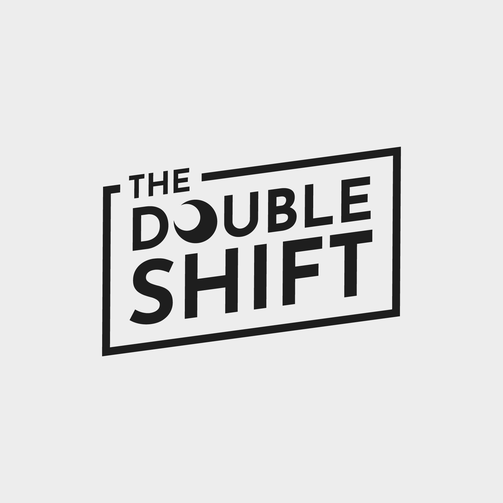

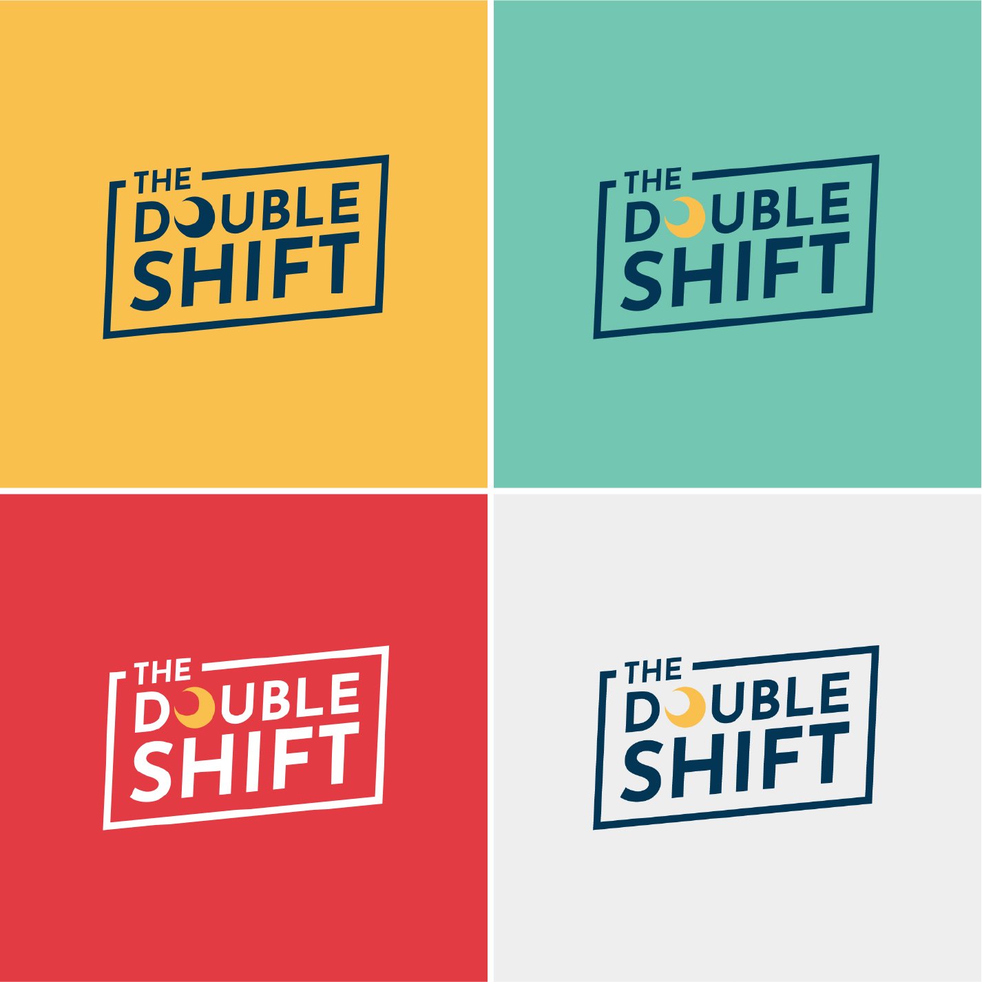
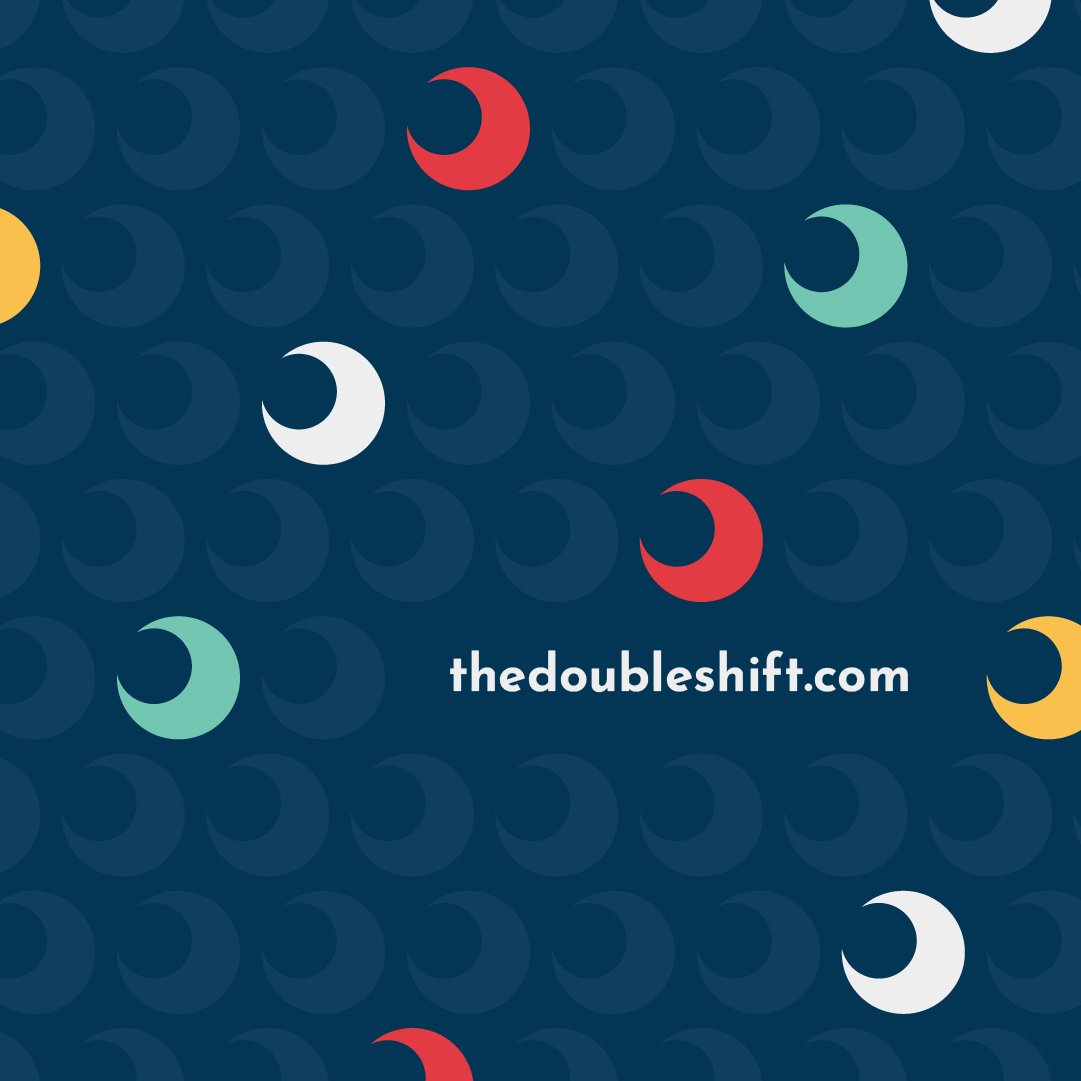
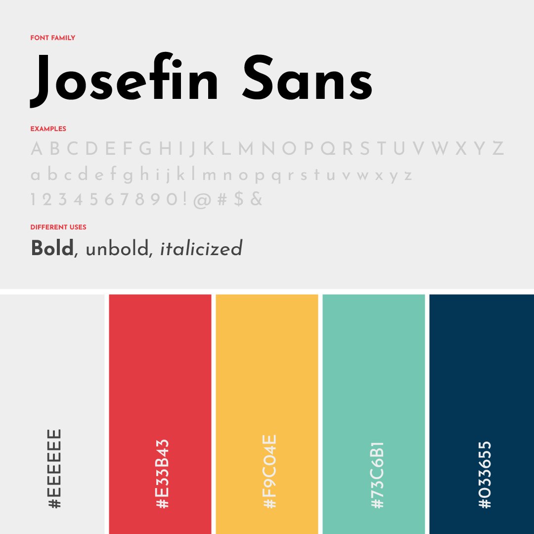
The Double Shift
This brand refresh includes a new logo, vibrant color palette + bold font selection that all together evokes the personality of TDS + the membership community. This new branding inspired the look + feel for the website (thedoubleshift.com) and social and was a part of TDS’s relaunch in June 2022.
About The Double Shift: Founded by Katherine Goldstein in 2019, #thedoubleshift is a newsletter, podcast, and community on a mission to make society + workplaces more equitable for moms + caregivers. Head to Instagram (@thedoubleshift) to learn more, subscribe to the newsletter, and sign up to become a member!

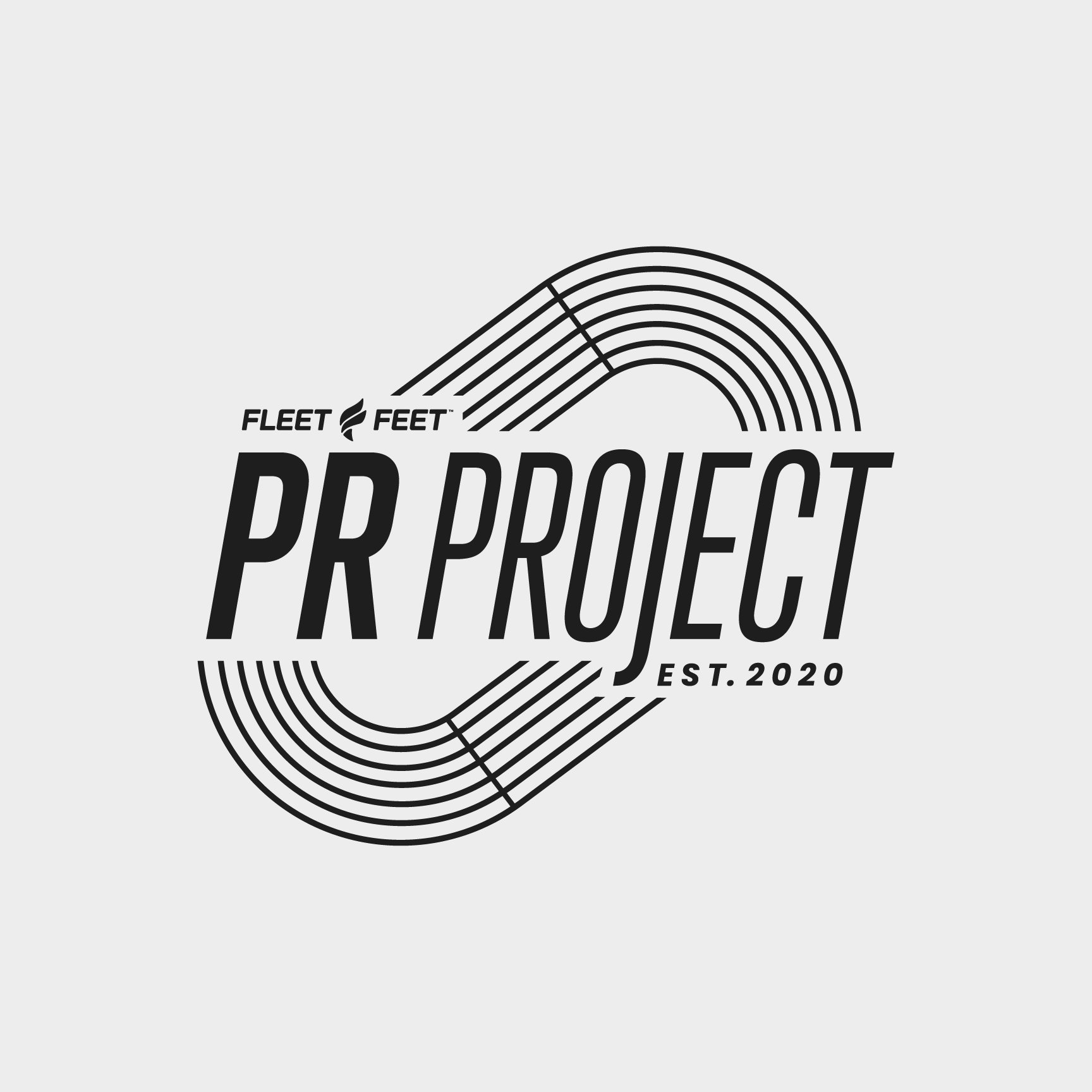
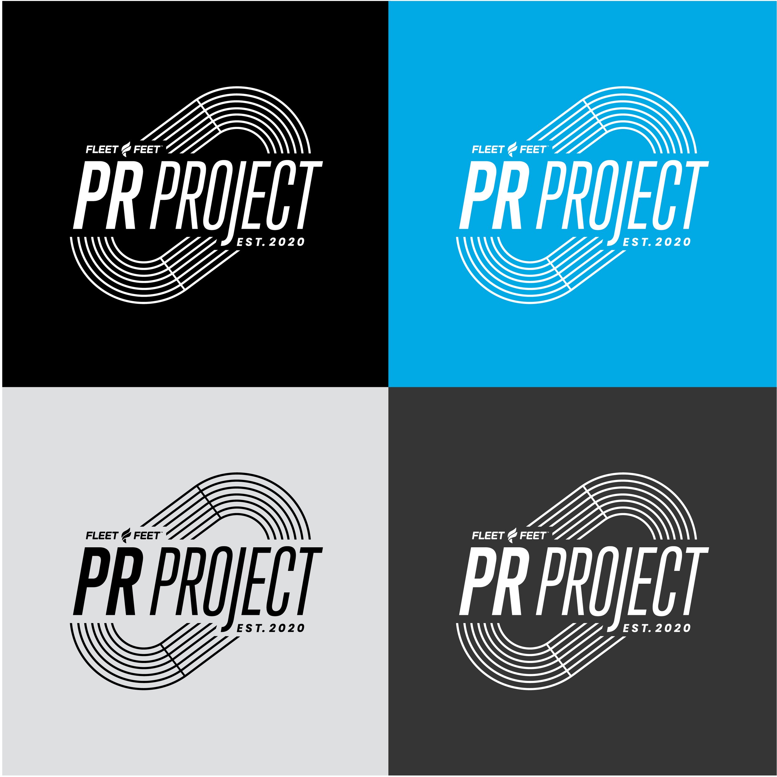
Fleet Feet: PR Project
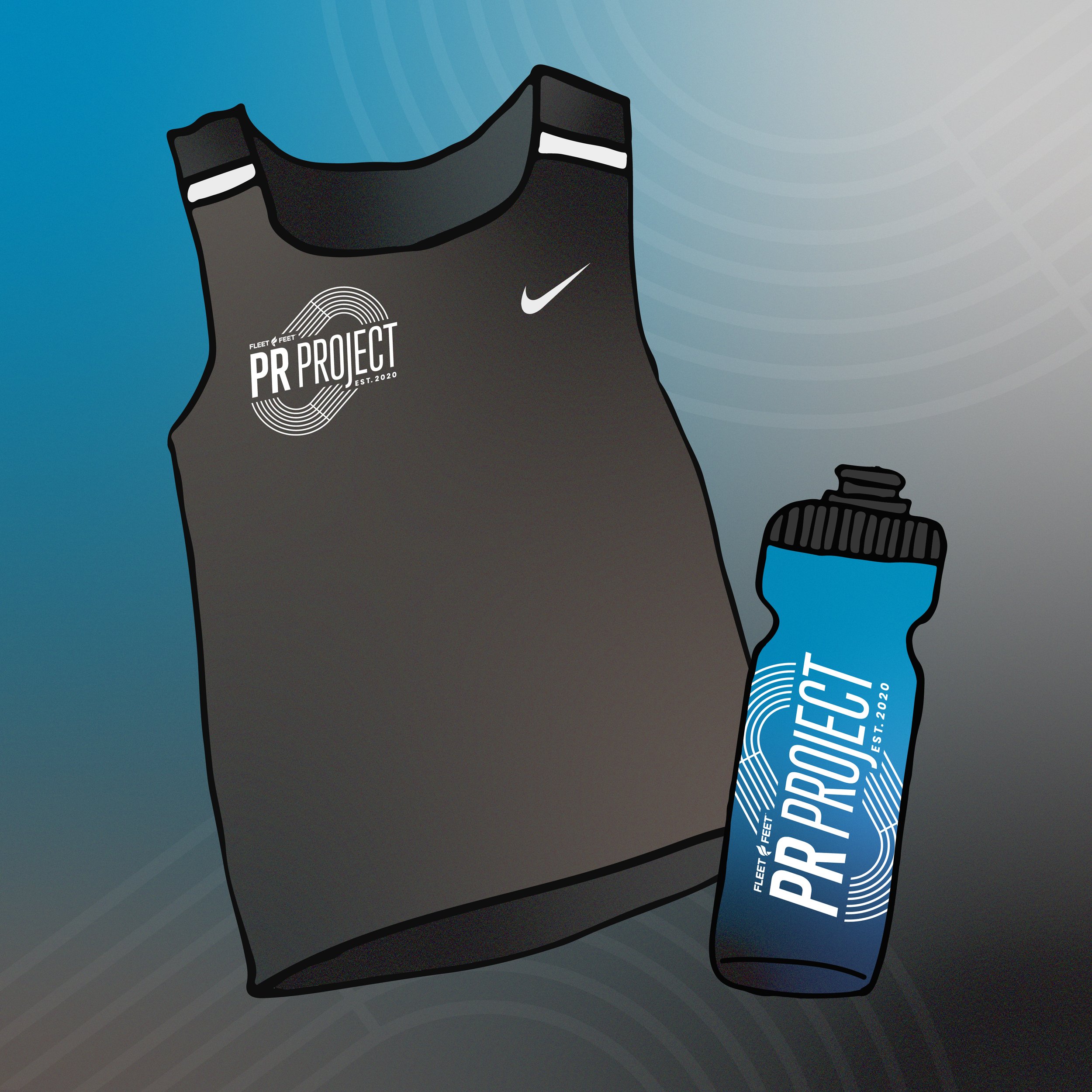
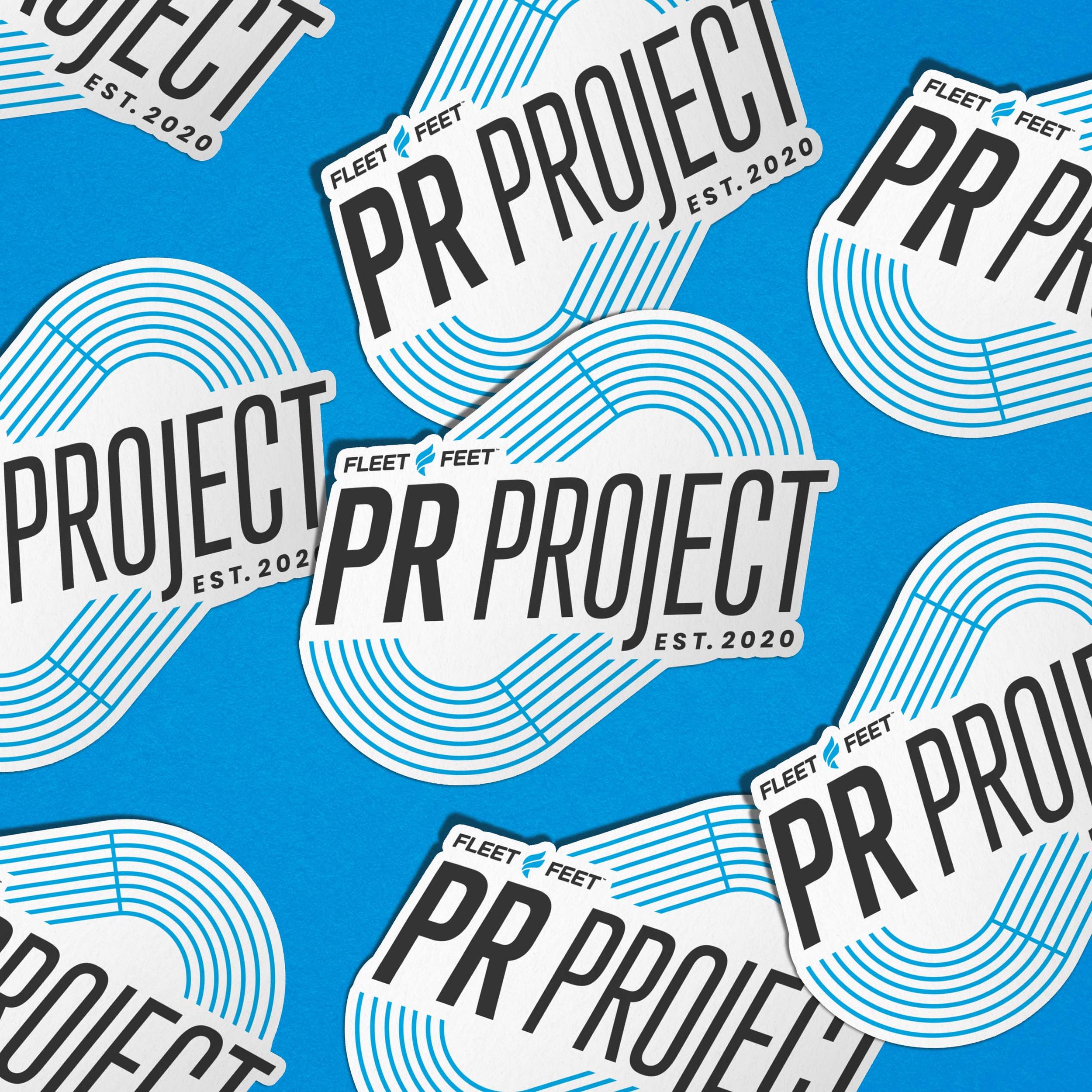
I was tasked with creating a logo for #PRProject, my local running training group hosted by Fleet Feet Carrboro/Durham. The group, established in 2020, takes place year-round and meets weekly for a variety of expertly coached workouts geared towards helping you achieve your next PR (personal record) while enjoying the sport with fellow runners. One of the most intense workouts takes place on the track — which has been integrated into the logo — and the font used evokes the movement + fast-paced feel of PR Project. This logo will be used across social, training plans and official PR Project merch, including running tanks and shirts. This is perhaps one of my favorite projects to date — bringing together my two passions of art and running.

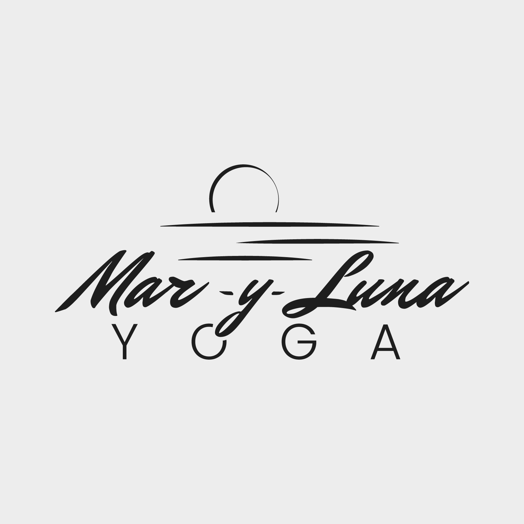
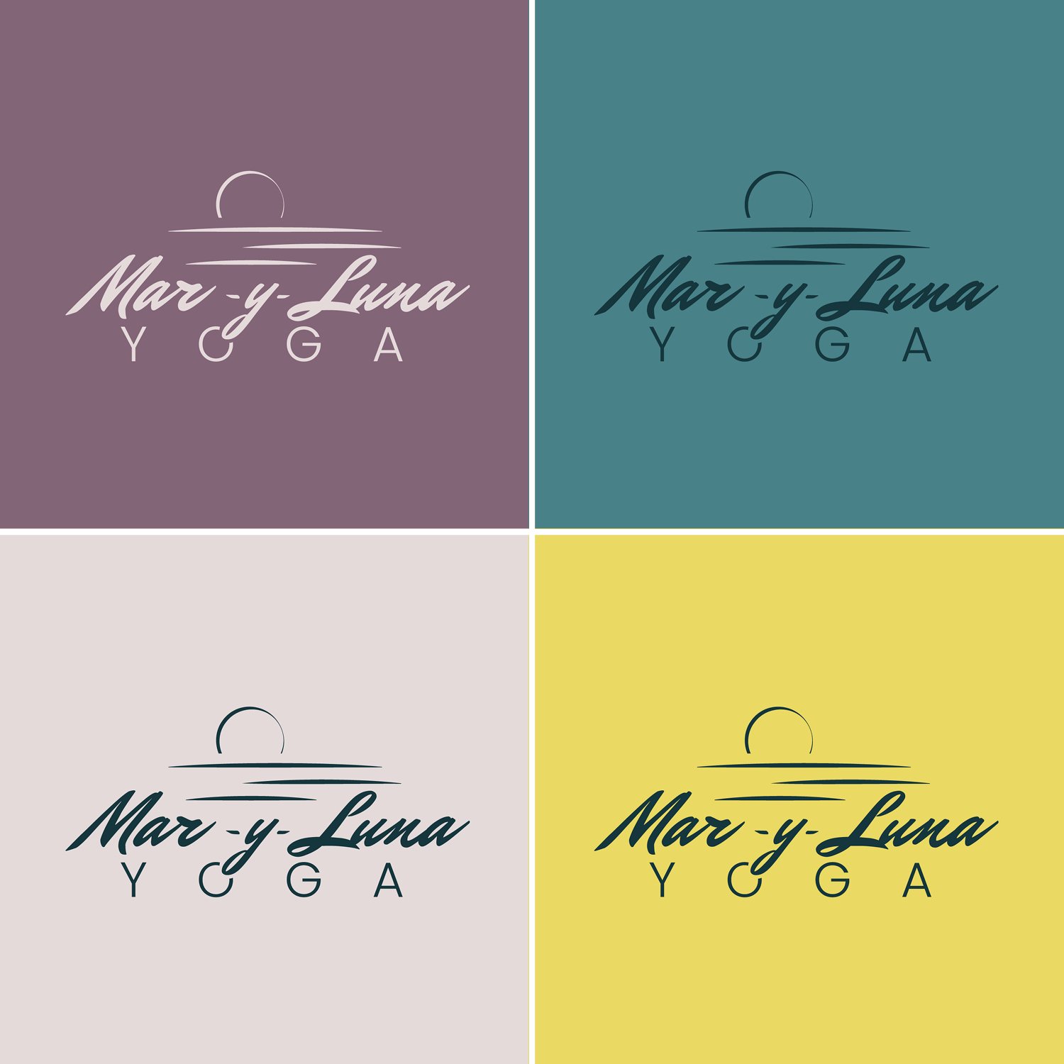
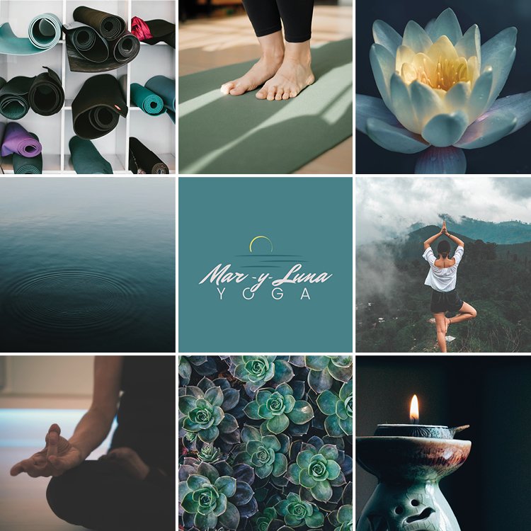
Mar Y Luna Yoga
I had the pleasure of updating and refreshing the logo, website, and visual identity for Mar Y Luna Yoga (which means “sea and moon” in Spanish). MyL is a holistic yoga practice that offers restorative classes and workshops. The modernized, updated Mar Y Luna Yoga site also features science writing and essays on thermodynamics and the mind (definitely worth a read!).
To capture the essence of Mar Y Luna, I selected a cool, but dynamic color palette and referenced the sea and moon in the logo. The typography has movement like the sea and the “O” and “G” in yoga reminded me of the curvature of the moon. This was a fun one to work on. Interested in learning more? Head over to Mar Y Luna’s IG or visit marylunayoga.com.

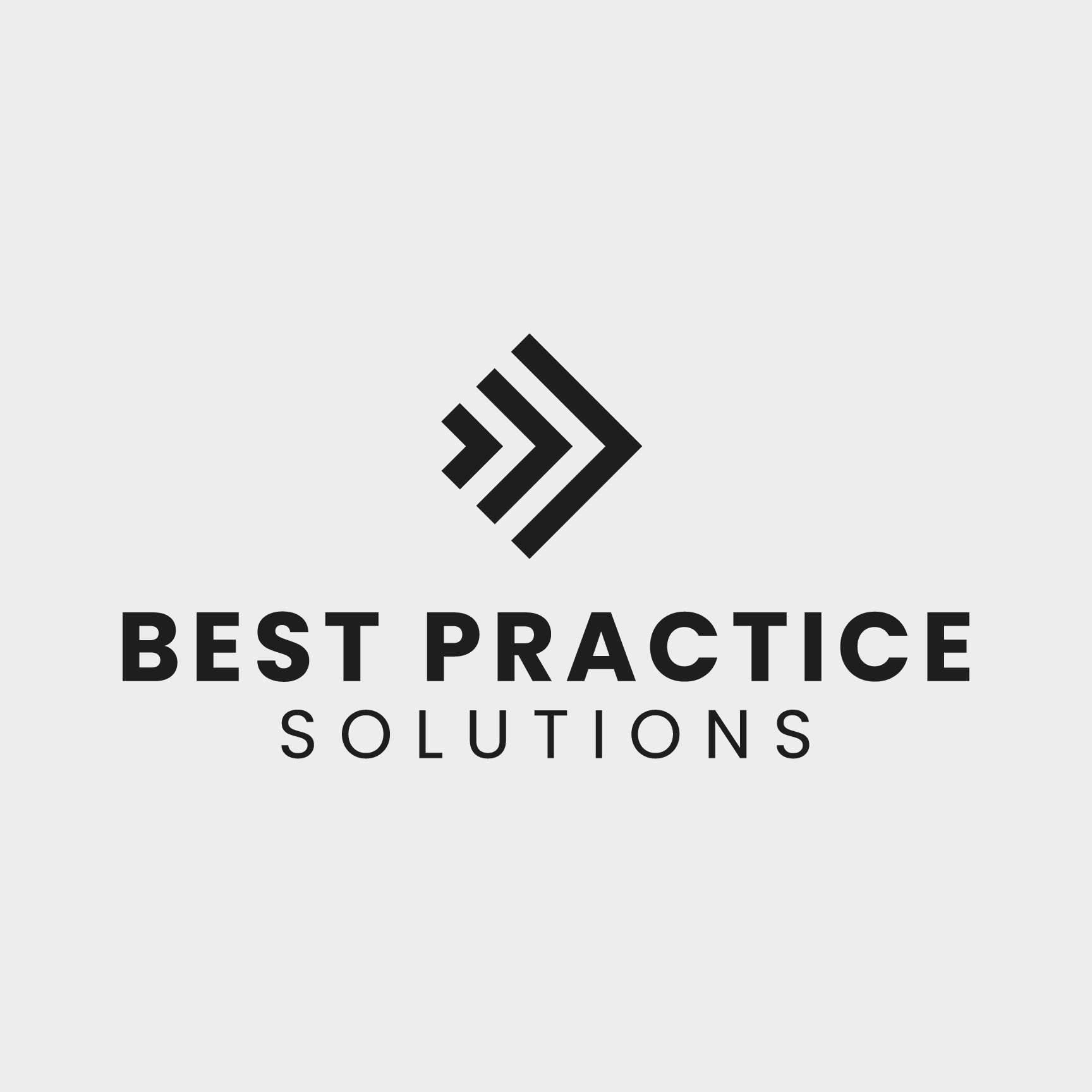
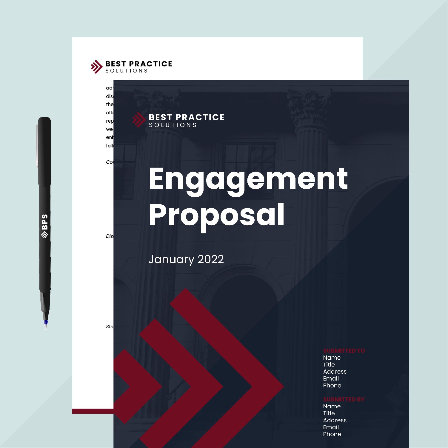
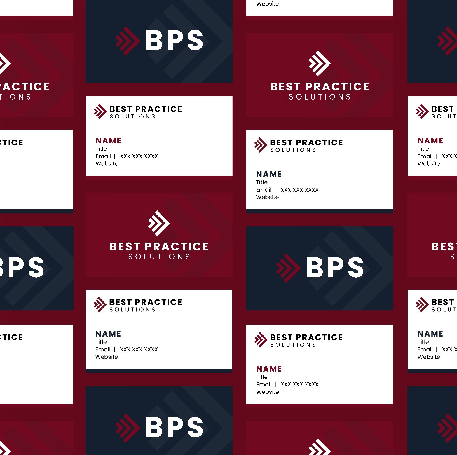
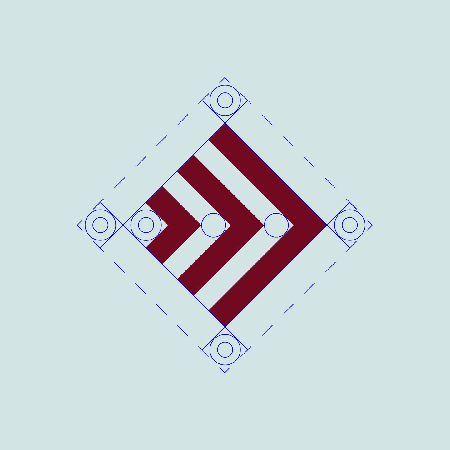
Best Practice Solutions
Here’s the logo + visual identity I designed for Best Practice Solutions, an independent consulting firm based in Chicago, IL. Clean, simple lines make up the logo and form an arrow to show movement and nod to the company’s mission of advancing best practices in enrollment management and financial aid services for higher education institutions. This brand rollout included incorporating the fresh, new logo into business cards, letterhead, proposal templates, and other collateral and coming up with a visual ID that is strong, bold and professional.

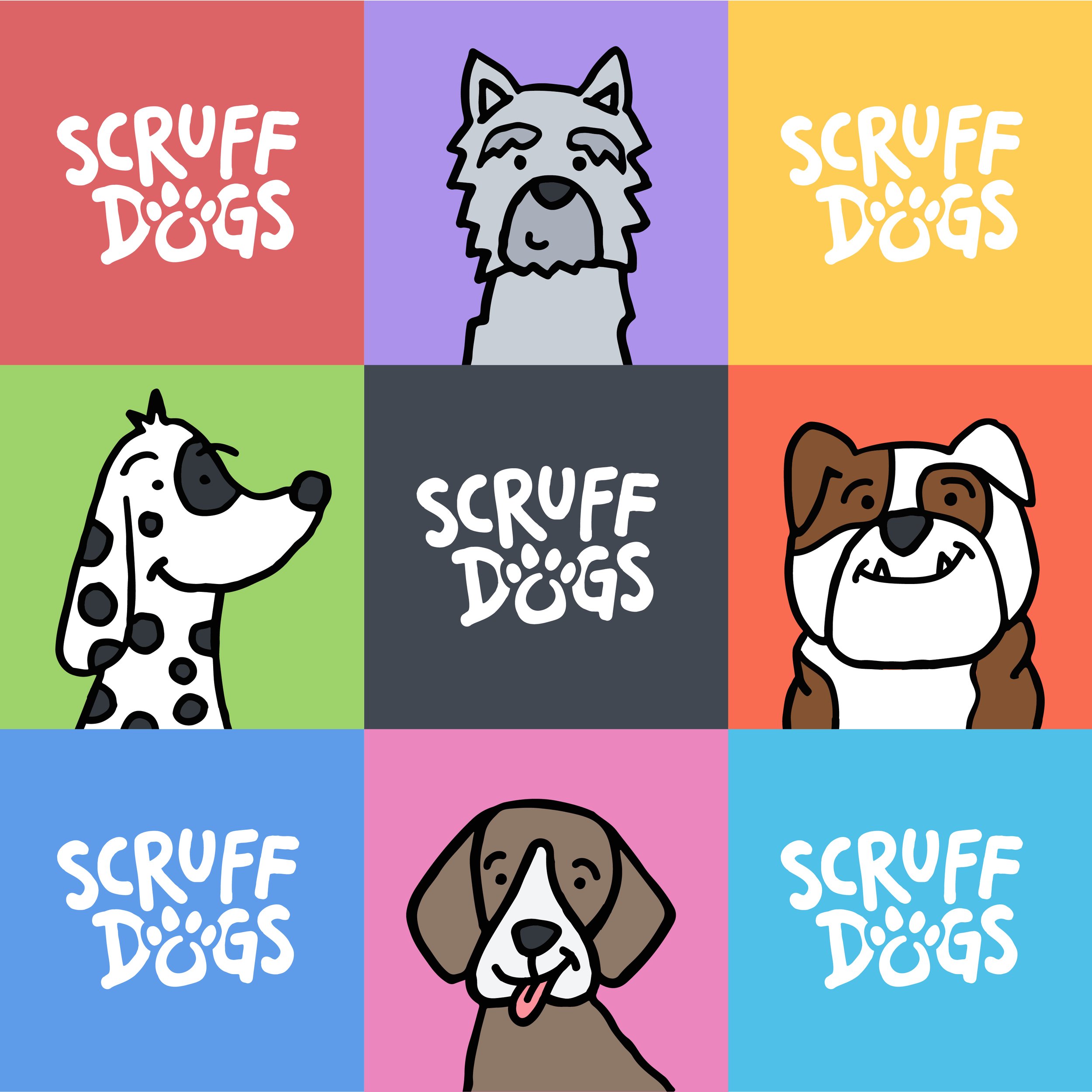
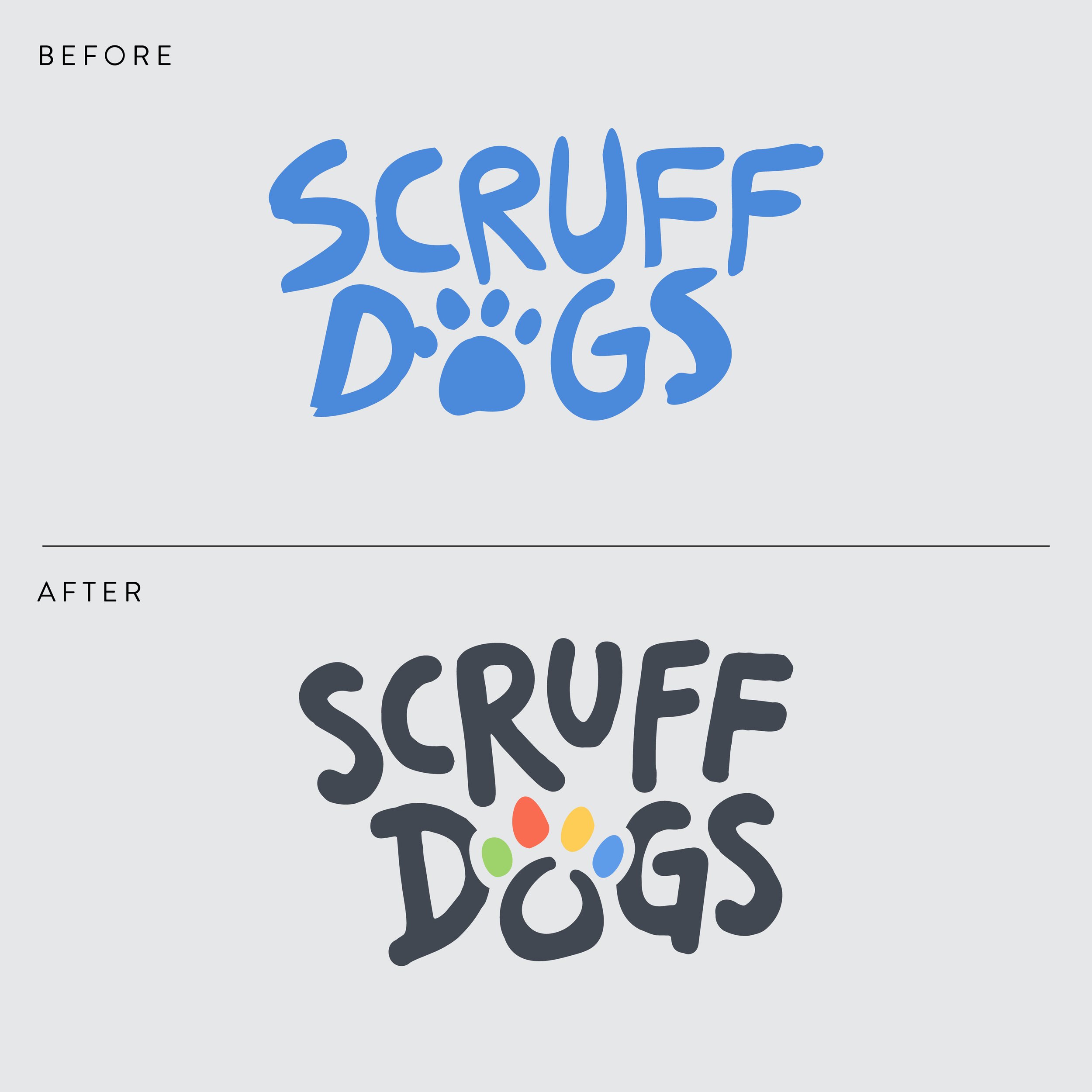
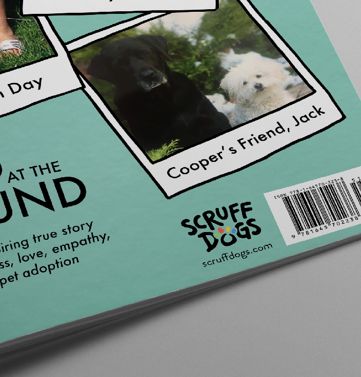
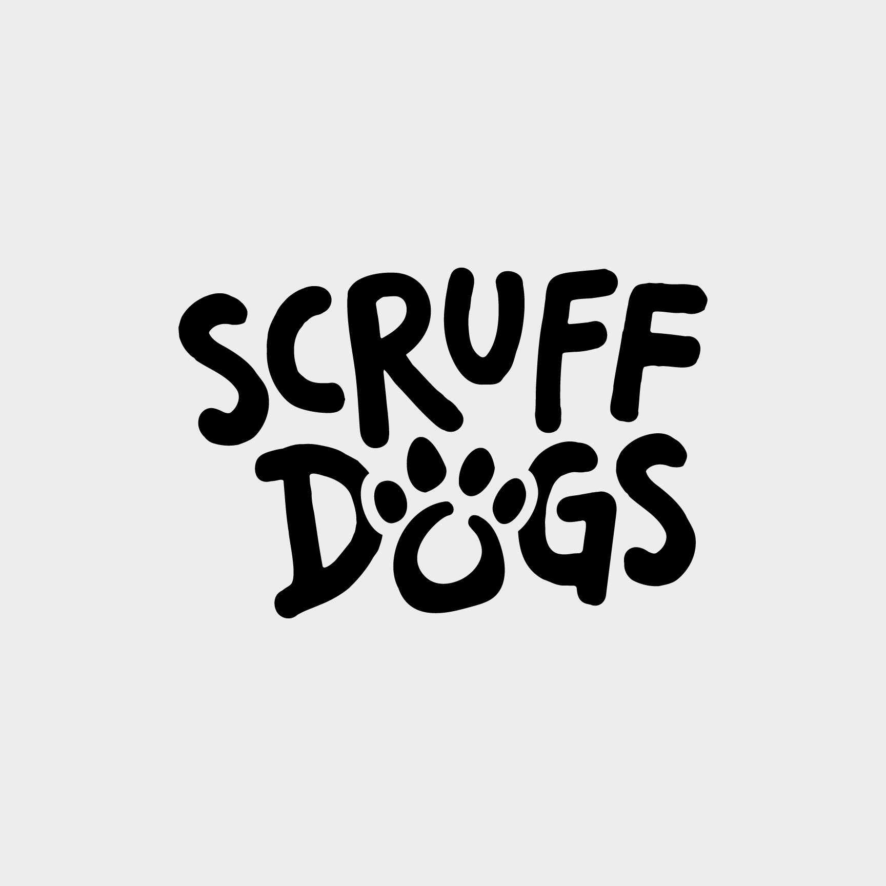
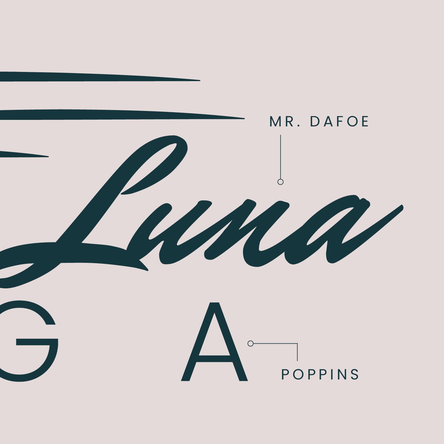
Scruff Dogs
A few years back, I created a logo for Scruff Dogs Books, a Greensboro, NC-based company that sells children’s books about pet adoption (including #FoundAtThePound, a book I illustrated that I've featured before). Recently, I realized it was time for a brand refresh — cleaning up and simplifying the script and adding more visual interest to the paw print. The overall goal? Capture the fun, whimsical nature of Scruff Dogs and the books it sells. This brand ID includes custom illustrations and an updated color palette that is integrated seamlessly with the website, social and book projects.